As an Amazon Associate I earn from qualifying purchases. Links below are affiliate links, which means I may earn a commission at no extra cost to you.
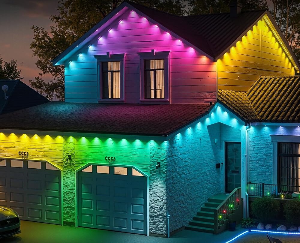
Custom color lighting is the practice of choosing shades that complement your siding, brick and trim instead of letting a strip cycle through a default rainbow. It matters more on a permanent installation, where the same display is visible every evening for months. This 100ft RGB+IC run puts 50 individually controlled LEDs along the eave, and the app can mix up to 16 million colors, so a shade can be tuned until it sits naturally against the house. This guide covers pairing color with common exterior materials, when brightness should stay low, and how to build a palette you will keep using.
Quick answer
Custom color lighting means dialing in specific shades in the app rather than accepting preset hues. With per-pixel control and up to 16 million colors, you can match trim, soften a warm white, or hold two complementary tones along the eave. The LotusLamp X app adjusts color, brightness, speed and sequence. Check the current price on Amazon.
Custom color lighting for your exterior
Start with the largest surface behind the lights. On light siding, a warm white or a pale amber tends to look clean, while a saturated blue can read as cold. On brick, warmer tones usually sit better because they echo the material’s red and brown range. Trim color is the easiest anchor: pick a shade a step lighter or a step warmer than the trim, and the outline looks intentional rather than random.
Because each of the 50 LEDs can show its own color, you are not limited to one tone for the whole run. A primary shade with a slightly lighter neighbor along the eave adds depth without turning into a multicolor display. That is the quiet advantage of a deep palette, described in what 16 million colors really means: the ability to make a small, precise adjustment.
Working with brightness and time of day
The same custom shade looks different at dusk and at midnight. A color that seems subtle at dusk can feel bright against a dark street later, so it is worth lowering brightness in the app and checking the result after full dark. A moderate setting is usually more welcoming than maximum output on a facade, and it keeps the display from washing out the siding detail you were trying to complement.
Another common surprise is how a shade changes against wet siding after rain. A color that looks balanced on a dry surface can appear sharper when the wall is damp and reflective. If you live in a wet climate, test your chosen tones on more than one evening before saving them as a permanent favorite, and lean toward warmer values, which tend to stay flattering in damp conditions.
The built-in timer helps here. You can have the lights start at dusk on a low, warm setting and stop at a fixed hour, which keeps the house pleasant without demanding nightly adjustments.
Blending tones along a long run
A single color across 100ft can look flat. A gentle blend, where one shade drifts into a nearby one, reads as more considered. How gradient outdoor lighting works explains which effects produce a smooth sweep and which create a hard split, so you can choose a mode that supports your palette instead of fighting it.
The key is keeping the two tones close. Two neighboring shades of warm white look elegant; a warm white next to a saturated green looks like a mistake. Per-pixel control makes the blend possible, but restraint makes it work. The same applies if your house already has strong architectural color; in that case, a single steady tone is often the cleanest choice.

Building a palette you will actually reuse
A permanent set rewards a small, repeatable palette. Choose one everyday shade, one slightly warmer evening tone, and one accent for occasions. Save them in the app and you can change the house’s mood in a few taps. Write down the settings once you settle them: it sounds fussy, but recording the shade, brightness and speed makes a look easy to rebuild if you ever reset the app or switch phones. For seasonal changes, holiday light colors for every season shows how a small set of tones carries the year without re-hanging anything.
When a gathering calls for something livelier, how music sync lights work covers the beat-driven alternative. Keep it for short bursts; custom tones remain the better everyday choice.
What to check before you buy
Custom color control is most useful to buyers willing to spend a few minutes tuning once.
- Confirm per-pixel control and a deep color palette are both stated.
- Check that brightness is adjustable in the app.
- Plan a sheltered spot for the rainproof control box and adapter.
- Make sure an outlet sits near the start of the run.
- Treat IP67 as the seller’s stated rating and keep the adapter dry.
- Read the up-to-50,000-hour life figure as a listing estimate.
FAQ
What color works on gray or beige siding?
Warm white and soft amber are safe choices because they add welcome without clashing. If you want a tint, keep it low in saturation so it reads as a hint rather than a statement.
Should I match the trim exactly?
Close is better than exact. A shade one step lighter or warmer than the trim makes the outline look deliberate while still standing out. Exact matches can disappear against the surface.
Can I save more than one palette?
Yes. The app lets you customize and save looks, so you can keep an everyday tone and a separate accent for occasions, then switch between them as needed.
Custom color lighting turns a permanent eave run into something that suits the house rather than shouting over it. If that approach fits your home, see the RGB+IC eave lights on Amazon to review the current set.
Views: 0